UX Designer at Udemy
Responsible for: User Researching, Interaction Design, Visual Design, Prototyping & Usability Testing.
Udemy, since 2010, has been on a mission to create new possibilities for people and organizations everywhere by connecting them to the knowledge and skills they need to succeed in a changing world. It is safe to say, as a company, we are trying to become the alternative to traditional adult, college, or university based education.
Innovation for Learner Success at
a Global Scale
_edited.jpg)
A lot of growth...but what is lacking?
Contextual Inquiry - How are users currently using Udemy?
To get a better understanding of the improvements that can be made on the current Udemy website, we as a team utilized many perspectives outside of our own. Gathering insights through task delegation & observation of volunteers current use of the website gave us a head start in finding the focus areas we should continue our research.
To get a better understanding of the improvements that can be made on the current Udemy website, we as a team utilized many perspectives outside of our own. Gathering insights through task delegation & observation of volunteers current use of the website gave us a head start in finding the focus areas we should continue our research.
To get a better understanding of the improvements that can be made on the current Udemy website, we as a team utilized many perspectives outside of our own. Gathering insights through task delegation & observation of volunteers current use of the website gave us a head start in finding the focus areas we should continue our research.
Competitive Analysis - What did we learn from competitiors?
Exploring the features in other online course options such as Skillsoft & Linkedin Learning revealed that Udemy is more of a commerce focused learning experience. We understood that our competitors were striving to engage with users in a way that doesn't differ too much from a traditional setting. Rivals focused on the learning environment rather than the amount of education options available for sell.

What I gathered.
Affinity Mapping the results from both methods present commonalities around the desire for a personalized experience, offering users options that would help them thrive when gaining a new skill. Interactivity & feedback were some of the keywords we extracted to move forward in synthesizing this data for usage in the later phases of our design sprint.
The Problem
Users want a more personalized experience while learning so that they can thrive in a collaborative learning environment.
How might we encourage users to interact with other students on Udemy?
How might we help our user make informed decisions on course selection for new skill acquisition?
How might we increase engagement through an online learning environment?
What we are solving.
Users want a flexible learning environment, feedback, and
interaction ---->
Users need to learn in flexible
sprints ---->
Users want to spend less time
searching ---->
What we will develop.
Group Learning Feature
Curate Personalized Selection
Create Curriculum & Task List
Group Learning Feature
My Design Decisions behind the early concepts of this new feature were based upon:
-
User's want for interactivity while learning.
-
Giving online students a space to share & measure their growth amongst one another.


Course Curriculum & Task List
My Design Decisions within the group feature included:
-
Long term curriculum planning supplied with recommended courses, filtered by the new onboarding process.
-
A task list creator to track progress of groups through weekly & daily assignments.
Udemy Onboarding Process
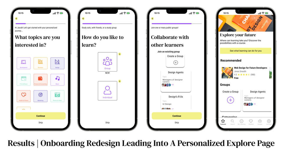
Our Redesign Decisions were developed in order to:
-
Customize the browsing process on home page preventing cognitive overload from overwhelming course options.
-
Simplify users decision making with early choice of topics of interest & level of study.


Is the design validated?
Qualitative Data
-
All users were observed and expressed being unclear about the difference offerings for group vs. solo learning
-
Users did express that they would like access to groups, especially when learning a new skill
-
All users completed the sign up with little to no errors
-
There was some confusion with wording and confirmation of sign up
-
Users found the recommended courses when building a curriculum to be effective.
-
Tracking progress & measuring growth is what users found would be helpful to validate new skill and excel further.
Quantitative Data
-
Amount of time taken to complete task
-
Numbers of error
-
Systems Usability System (SUS)
-
Although onboarding was meeting benchmark in the first iteration we reduced it by 60 seconds
-
Secondly, from v1 to v2 we decreased the error rate from 2 to .5
-
Finally, according to SUS results of version 2, users overall satisfaction, efficiency and functionally increased nearly 30 points to 84.4
After multiple testing rounds of our mid-fi wireframes, we used these metrics to find where to improve when finalizing our prototype
& What did they say?
How did users impact the design?

